
While working with the Biden Campaign during the 2020 Election, Dylan was granted the task of developing logos for Democratic Groups in Northeastern Ohio. These groups operated on a county level, and helped the Biden Campaign organize volunteers and help voters. The organizations were established, but had no cohesive way to identify themselves, so the Biden Campaign reached out and offered to help. Dylan lead the design process with the help of Field Organizer Robert Lyons. The two went through the design process with the county group leaders, and were able to establish a new logo that they all could use.
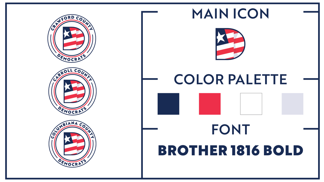
Wanting to create a stronger logo than the groups were already offered by the Democratic Party, Dylan began researching design trends that reflected a modern political group. The decision was made to base the logo around the Democratic "D" logo combined with a minimal representation of the American flag. This flag icon is intended to imply a "waving" motion, but in a non-complex shape. The color palette is taken directly from the Biden Brand Guidelines (The selected palette was taken directly from the U.S. Flag). The Typeface is also apart of the Biden Branding Guidelines, Brother 1816 Bold, which appears in the original "BIDEN" campaign logo, before the logo was altered after Kamala Harris joined the ticket.
